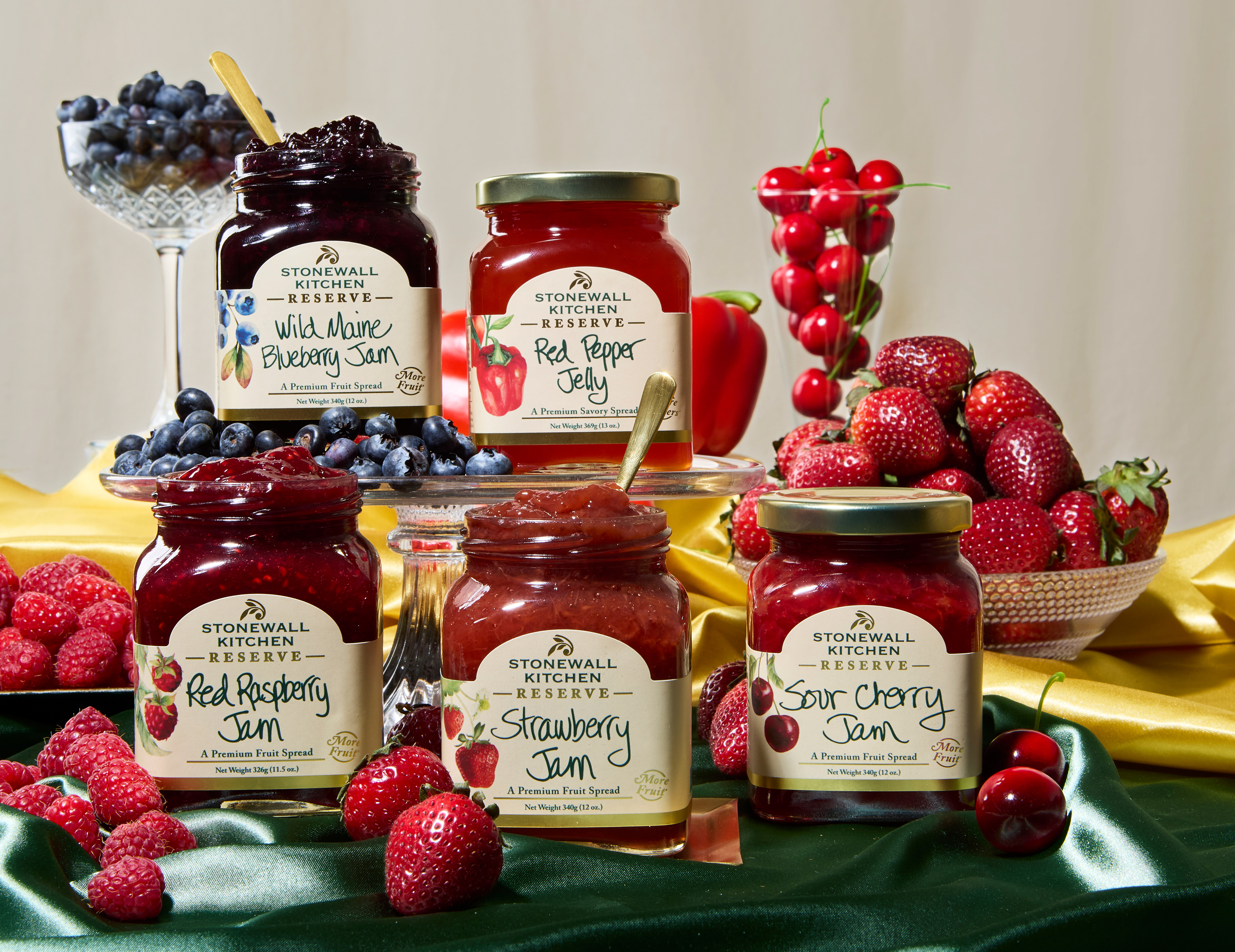
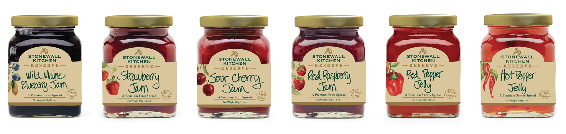
A premium extension of the Stonewall Kitchen line, designed to signal elevation without abandoning the brand's warmth. I built the visual identity around the core brand green and gold, keeping the palette deliberately restrained so the only color variation comes from the fruit and vegetable ingredients themselves. That restraint was intentional: Reserve is about more fruit, less sugar, and the packaging needed to feel as honest as the product. Typographically I leaned into traditional serifs, old world elegance reframed for a modern shelf. For the photography I art directed around rich velvet textures and the quiet abundance of real fruit, letting the ingredients speak for themselves.